The owner of the apartment likes to invest in quality things, and even though she only wears black and white, she had her apartment dressed in colors. Interior designer and artist Markéta Daňková likes colors, she is patient with the authenticity of materials, high utility value and quality of workmanship down to the last detail. The result is a unique interior with original wallpapers that give the space a new perspective.
It’s beautiful how the interior designed by the previous designer worked in a new building a few years ago, which I found appealing,” says interior designer Markéta Daňková. The family’s life situation changed and they could no longer use the space as they wanted. There was no room for a spacious table or a large enough sofa. In the middle of the living room, in the place of the current dining table, there was a partition separating the kitchen from the living room. Markéta had to solve the layout so that it fully met the family’s current needs. The partition had to be demolished. She had the original entrance walled off in the place of the current high kitchen section with pantry, creating a storage niche in the hallway, and moved it to the living room, where there is usually not as much furniture as in the kitchen. This solution made it possible to design a larger L-shaped kitchen with a spacious pantry cupboard, which also accommodated a dining table with a bench and chairs. The apartment is located on the ground floor and also has a roofed terrace, so there is relatively little light in it, which was one of the The reasons why Marketa decided to play with light pastel tones and a larger number of shiny reflective surfaces, which will further increase the luminosity. The high-quality original dark floor represented a solid foundation for the interior.
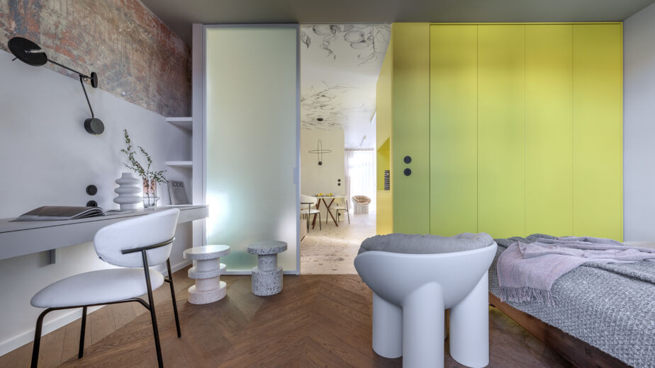
„I wanted the whole space to be changeable. Using crayons, to put it in layman’s terms, I drew vertical stripes and tried to achieve the feeling of a blurred view of the landscape. Each stroke of the crayon has a slightly different shade of the color that was already used in the interior, thus multiplying the colors. „I wanted to use such a palette of pastel shades that would create a compact feeling that is not colorless, but the wallpaper remains delicate,“ says artist Markéta Daňková. In addition to the aforementioned turquoise, the interior features a significant amount of green, blue, and gray-green-blue shades. That’s quite a lot of colors for such a small space, but that’s the point. The designer’s goal was to project a certain color emotion into the interior, so that family living wouldn’t just be sterile and monotonously colorful. The glossy surfaces absorb the shades of the surroundings, which gives the impression that the colors change when you walk through the interior. The author’s wallpaper also decorates the wall in the bedroom. „A landscape lightly applied with watercolor. I like when watercolor is enlarged and makes such traces of spreading, which creates very nice textures in the interior,“
Markéta Daňková
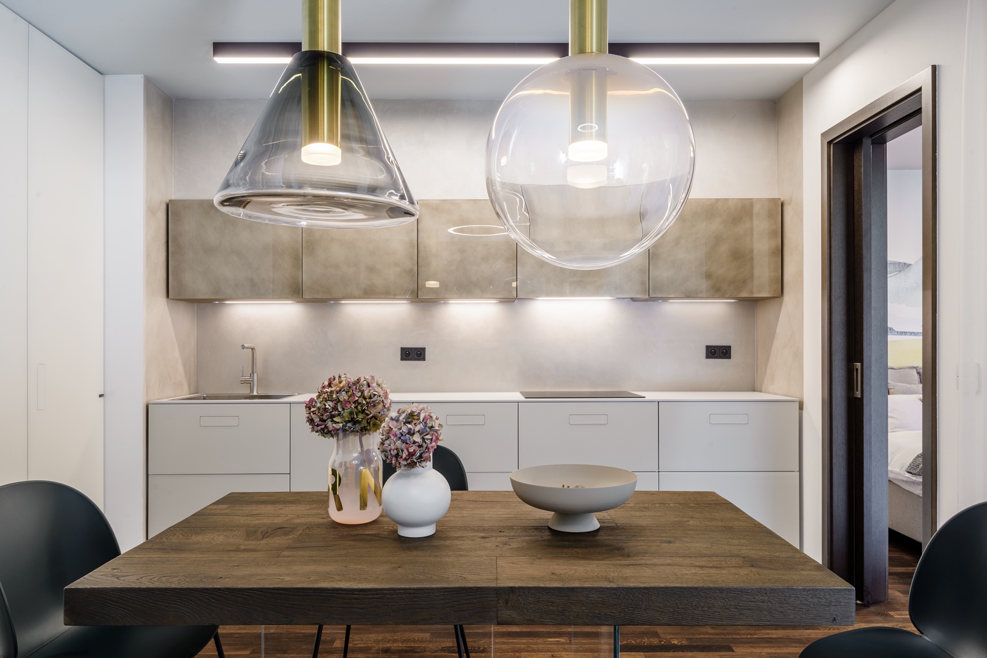
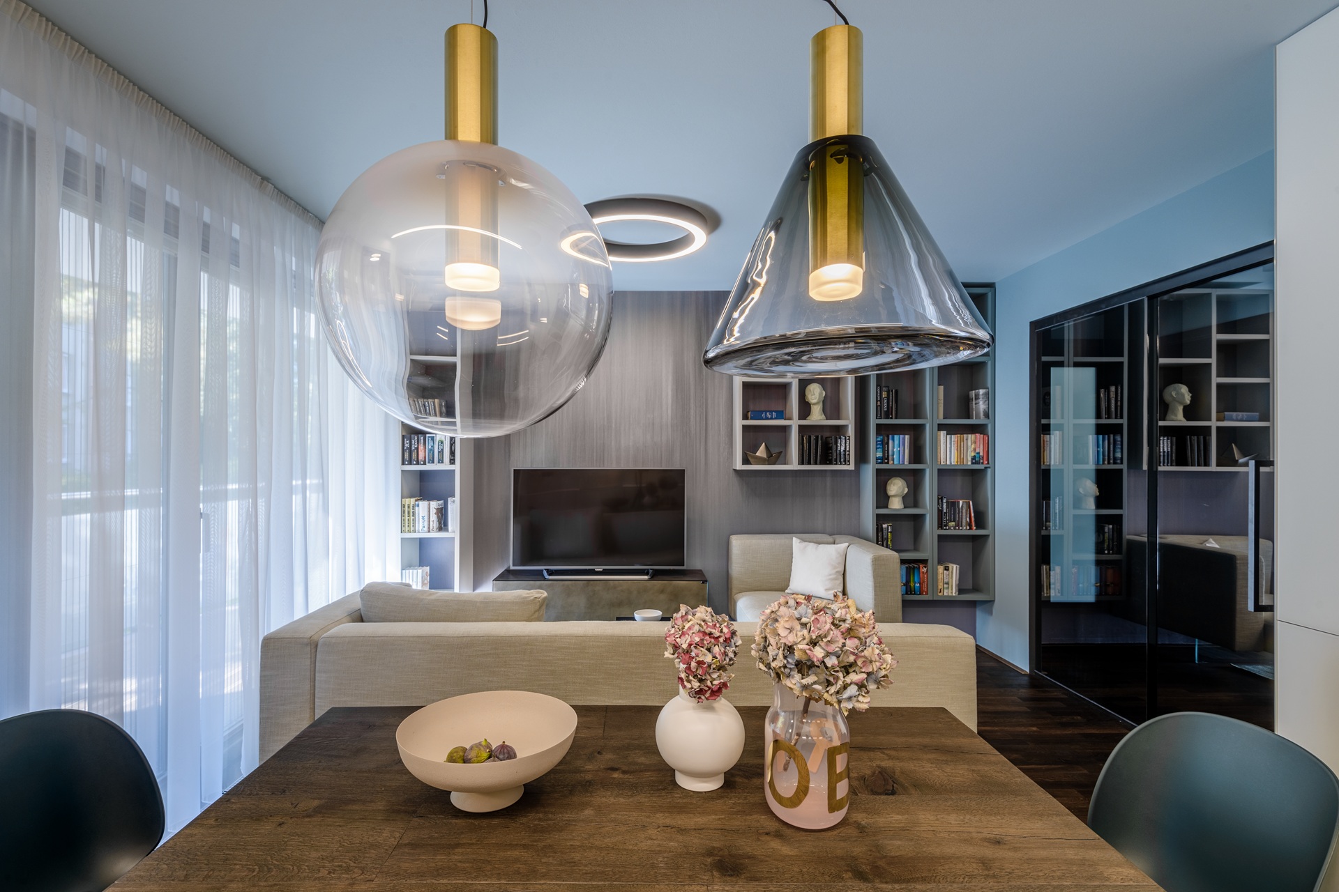
The color scheme of the Lago kitchen with glass fronts in almond beige with white and gold is complemented by a glossy spatula with a light pearlescent effect, which works similarly to the upper cabinets with golden reflections. The designer’s intention to add touches of luxury in the form of gold to the interior was thus achieved perfectly. The beautiful shades of Lago change beautifully depending on the lighting conditions, which was the intention from the beginning. The furniture in the living room is also from the same brand, in addition to the bookcases, which are custom-made according to the designer’s design in two shades, almond and pastel turquoise, appearing in a subtle nuance also on the ceiling and on the wall with sliding doors with smoked glass. The layout of the apartment is very cramped. For this reason, Marketa chose transparent legs for the table and sofa, everything else is suspended, the chairs are on thin legs, which is a solution that makes the floor stand out and at the same time erases the contours of the functional zones, thus achieving a feeling of greater space. The only thing she brought down to the ground is the kitchen, whose compact shape beautifully fills the space and merges with the wall.